
Gray has been my challenge supreme since we moved into our current house a few years ago. Such a challenge, in fact, that we’ve actually repainted a couple or rooms more than once trying to get the shade right against the lighting in our house. Let my and Ryan’s shoulder pain from rolling and blue tape parties be lessons to save you time.
Our current house is a south-facing house, with a slight tilt to the west. We also have a lot of greenery surrounding our house, which can cast green shadows on our walls. This was a change from our last house, which faced east and our typical living space was in western sun throughout the day. From our house situational direction, we’ve learned that the sun can really – REALLY – impact how a color turns out on your walls.
Time of Day Impacts
Typically in the early hours of the day, sunlight will be warmer because it’s lower on the horizon. As the day turns to mid-afternoon, the sunlight lowers and turns into a cooler color, progressing to a washed-out shade if it is in direct sunlight. As the day turns to sunset, the shade will warm back up. For a few of my rooms, the fact that the greenery is right outside our Pacific Northwest windows means that our hues tend to be even more blueish than say if we lived in Tucson at a lower latitude and with less trees outside our windows.
A shade’s LRV, or light reflectance value, also plays a key role in how the hue will appear in your space. LRV is the amount of light that reflects from a surface. 100 is pure white, with absolute black at 0. Dark tinted paints have a lower LRV than lighter ones. So, if your space has low lighting and many shadows, you should look for a lighter tint or high LRV.

Warm greiges
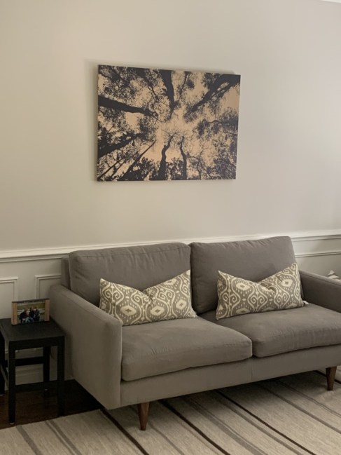
I love a good warm greige. Those shades have tended to be the best in my greenish-southern facing natural lighting. For my office repaint, we picked Benjamin Moore’s Edgecomb Gray. This is a popular color, because it is SO AWESOME and goes with so many colors. It’s LRV is 63.88, meaning it’s a fairly light tint.

You can get a sample online here to test it out. Here’s the shade in our Office, with just natural mid-afternoon light coming in:
Similar table | Sofa | Similar Pillows | Similar Art
Benjamin Moore Sea Salt, from the Aura Paint Color line, is another greige favorite of mine. This paint has a LRV of 62.93. Some “sea salts” can tend to be more green or blueish, but in our kitchen, this color turned out warm and exactly what I was looking for in the morning and afternoon light. This color would be perfect for a bathroom or bedroom for a tranquil vibe.

A designer go-to I’ve seen across the internet is Revere Pewter. This shade has a bit more depth to it, with a LRV of 55.51. Revere Pewter is a transformational color, and lighting and situational natural light can have a big impact on how this turns out. In our north-facing bedroom, the shade is a nice calm greige, but when we sampled it for our downstairs family room, the shade was a little green for us. Revere Pewter is on the color line with Edgecomb Gray, and they coordinate beautifully.

Here’s another example, curtesy of John McManus Fine Art.

If you want a gray-blue…
While I typically navigate to warmer greige-colors, some of the shades I love are more of a gray-blue, or at least have turned out more gray-blue in our lighting. When we repainted our family room, I wanted a very neutral, almost white, greige. I picked Benjamin Moore’s Abalone which has a light reflecting value of 63.06. It is a beautiful color and I thought it was perfect on my walls, until morning light came and throughout midday the shade looked more purple on my walls.

More about those white-grays...
If you want a white-gray, Benjamin Moore’s Balboa Mist has been one of my tried and trues. This shade is transformative throughout the day, which was not something I loved in our last house when we used it in our master bedroom, but that grew on me in our current house. We now have this shade in four different rooms. This shade has a LRV of 67.37. It can tend to have a slight blueish hue in some lights, but not as much as Abalone.

Another white-gray I’m loving is Pale Oak. This was one I turned to when Abalone failed me in my family room (thank you Ryan for being such a sport and paining the room again!). One of these days I’ll update our furniture when the kids are not so young and messy, but we’re stuck with a brown sofa and beige chair, and while I wanted to go grey in this room this shade balances between the colors nicely.
Pale Oak, with a LRV of 69.89, is a very pale shade that straddles the beige/gray line perfectly. Throughout the day, this shade in my family room remains the light greige I wanted and pairs perfectly with grays and browns.

Here’s an image from designer Noelle Micek:

And here’s a glimpse of our living room, which shows the lighting of the day can impact how the color appears:

Media Console | Similar Lamps | Brass Owl
And if you are looking for something with even more tint…
Benjamin Moore’s Ashley Gray is a beautiful rich gray (here’s a comparable online version). It pairs nicely with gray wood furniture and whites. With a LRV of 32.38 (see how low this is?), this shade has much more depth to it than the other colors we leaned towards in our house. We thought this was an excellent dining room shade, where we have our son set up for online learning this year.


Similar table | Magazine Holder | Similar Tote | Pencil Jar | Headset | Chair


